
What We Review
Introduction: Why One-Variable Data Matters on the SAT®
The SAT® Math section groups questions into four domains, and “Data Analysis” is one of them. Roughly 15–20\% of the test checks whether students can read, describe, and compare data sets. Therefore, becoming comfortable with one-variable data SAT® Math skills is an easy way to collect quick points.
After reading this guide, students will be able to:
- Choose the best graph for a data set
- Interpret frequency tables, histograms, dot plots, and box plots
- Calculate and compare mean, median, and range
- Understand what standard deviation tells us without memorizing its formula
- Predict how an outlier changes a data set
Choosing the Right Graphical Representation
Quick Snapshot of Common Graphs
| Display | What It Shows Best | Data Size |
| Dot plot | Every individual value | Small (n < 50) |
| Histogram | Overall shape and bins | Small-to-medium |
| Boxplot | Five-number summary | Medium-to-large |
| Frequency table | Exact counts | Any size |
When to Use Each Display
- Dot plot
- Pros: easy to spot clusters and gaps.
- Cons: messy if hundreds of points.
- Histogram
- Pros: shows distribution shape quickly.
- Cons: actual values inside a bar are hidden.
- Boxplot
- Pros: great for side-by-side comparisons.
- Cons: hides individual points.
- Frequency table
- Pros: totals and cumulative counts are explicit.
- Cons: visual pattern is not obvious.
Example 1: Pick the Best Graph
Data set (15 students’ quiz scores out of 10):
10,10,9,9,8,8,8,7,7,6,6,6,5,5,4Step-by-Step
- Are individual values important? Yes—teachers may want to see every score.
- Is the data set small? Yes—only 15 numbers.
- Therefore, a dot plot works best. It displays each score and still keeps the visual uncluttered.
Practice 1
A factory records the weights (to the nearest gram) of 500 cereal boxes. Which graph is most practical?
- Dot plot
- Histogram
- Boxplot
- Frequency table
Answer: Histogram (too many points for a dot plot; a histogram will show shape without listing 500 numbers).
Reading Graphs Like a Detective: Interpreting Visual Data
Frequency Tables
Look for:
- totals (sum of all frequencies),
- highest frequency, and
- cumulative counts (running totals).
Histograms
- Bin width—how many units fit in each bar.
- Tallest bar—mode range.
- Gaps or empty bins—possible breaks in data.
Dot Plots
- Clusters—groups of dots close together.
- Peaks—most common value.
- Individual outliers—dots far from the rest.
Boxplots
- Five-number summary: minimum, Q1, median, Q3, maximum.
- Whiskers—show spread within 1.5 × IQR.
- Possible outliers—points beyond the whiskers.
Example 2: Interpreting a Boxplot (SAT®-style)
A boxplot of weekly study hours for 40 is shown below.
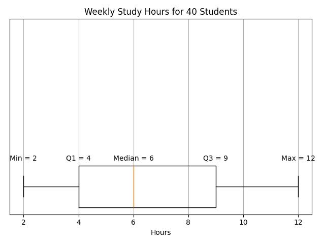
Question: What percent of students study at least 9 hours per week?
Solution
- In a boxplot, the top quartile (Q3 to Max) represents 25\% of the data.
- Therefore, 25\% of students study at least 9 hours.
Practice 2
If the median is 6 hours, how many of the 40 students study fewer than 6 hours?
Answer: 20 students (half of the data set).
Measures of Center: Mean vs. Median
Friendly Definitions
- Mean: the “fair share” value found by adding and dividing.
- Median: the middle value when data are ordered.
Quick Mean Trick
Add the numbers quickly, then use divisibility rules. Estimation first helps identify arithmetic mistakes.
Median Shortcuts
- Ordered already? Grab the middle number.
- Unordered? Count items, find the middle position, then sort only until that spot.
Example 3
Data: 3,3,4,6,10
Step-by-Step
- Mean
- \text{Mean} = \dfrac{3+3+4+6+10}{5} = \dfrac{26}{5} = 5.2
- Median
- The ordered list is already above. Middle (3rd) value = 4.
- Which is more “typical”? The data has one large value (10) that pulls the mean up. Therefore, the median describes a normal score better.
Practice 3
Numbers: 7,8,9,10,100. Compute mean and median. Which one the SAT® is likely to call “typical”?
Solution: Mean = \dfrac{134}{5}=26.8; median = 9. Median is more typical because 100 skews the mean.
Measures of Spread: Range and Standard Deviation
Range in a Flash
\text{Range} = \text{largest} - \text{smallest}
Standard Deviation: Intuitive View
Standard deviation (SD) measures how far, on average, the data points sit from the mean. Therefore, a larger SD means values are more spread out. No formula is required for SAT® Math; understanding relative size is enough.
Example 4: Same Mean, Different Spreads
Set A: 5,5,5,5,5
Set B: 1,3,5,7,9
- Both means are 5.
- Range of A = 0; range of B = 8.
- Because numbers in B vary more, its SD is larger.
Practice 4
Which set has the larger SD?
Set C: 4,4,4,6,6
Set D: 1,4,4,4,7
Answer: Set D. Both have mean = 4, but Set D has values 1 and 7 that sit farther from 4.
Comparing Two Distributions
Different Means, Same SD
If Distribution 1 has a higher mean, its data on average are larger, even though both spreads are similar.
Same Mean, Different SD
When means are equal, the narrower SD shows more consistency.
How the SAT® Frames Questions
Phrases like “Which class had the greater typical score?” or “Which data set shows more variability?” often appear.
Example 5: Side-by-Side Boxplots
Boxplot A (Test 1) median = 78, IQR = 10.
Boxplot B (Test 2) median = 74, IQR = 20.
Question: Which test shows more variability?
Solution
- Compare IQRs because they measure middle spread.
- Test 2 has IQR = 20 > 10, therefore Test 2 is more variable.
Practice 5
If the whisker length (max-min) of Test 1 is 30 and Test 2 is 32, does that change the answer?
Answer: No. Both range and IQR are larger for Test 2, confirming greater variability.
Outliers: The Data Set “Wild Cards”
Spotting Outliers
- Dot plot: lonely dot far away.
- Histogram: isolated bar.
- Boxplot: single points beyond whiskers.
- Frequency table: surprisingly low/high count in an extreme category.
Effect on Mean
An outlier pulls the mean toward itself.
Effect on Median
Median usually stays put unless the data set is extremely small.
Example 6
Original data: 4,;5,;6,;7,;8
Mean = \dfrac{30}{5}=6; median = 6.
Add an outlier 30: 4,;5,;6,;7,;8,;30
New mean = \dfrac{60}{6}=10 (increased by 4).
New median = average of 3rd and 4th values = \dfrac{6+7}{2}=6.5 (small change).
Therefore, the mean is much more sensitive than the median.
Practice 6
Add an outlier of −10 to the original five numbers. What happens?
The mean drops to \dfrac{20}{6}\approx3.3; median becomes 5.5. The same pattern holds—the mean changes a lot.
Summary Tips for Test Day
- First, read the question stem. Decide which graph or statistic is needed before calculating.
- Estimate with mental math; then verify with precise work if required.
- Look for clue words: “typical” → think median; “average” → think mean; “approximately” → rough estimate accepted.
- Check for outliers. If present, consider using the median for center.
Quick Reference Chart
| Term | Simple Definition | SAT® Tip |
| Mean | Sum of values divided by the number of values | Watch out for outliers; mean shifts easily |
| Median | The middle value when ordered | Stable when an extreme number appears |
| Range | Max – Min | Fast snapshot of the spread |
| Standard Deviation | Average distance from the mean | Larger SD → more spread-out data |
| Outlier | Value far from the rest | Pulls mean, barely touches median |
| Histogram | Bar graph of bins | Check the tallest bar for the mode |
| Boxplot | Box + whiskers showing five-number summary | Great for comparing two or more groups |
| Dot Plot | Dots for every data point | Best for small data sets |
| Frequency Table | List of values with counts | Quickly add or find cumulative totals |
Final Call to Action
Strong one-variable data SAT® Math skills remove surprise from the test. Next, review actual College Board practice questions to see these concepts in action. For additional free problem sets and timed drills, explore reputable online platforms and official SAT® practice tools. Consistent practice turns data displays into easy points on test day. Good luck!
Sharpen Your Skills for SAT® Math (Digital)
Are you preparing for the SAT® Math (Digital) test? We’ve got you covered! Try our review articles designed to help you confidently tackle real-world SAT® Math (Digital) problems. You’ll find everything you need to succeed, from quick tips to detailed strategies. Start exploring now!
Need help preparing for your SAT® Math (Digital) exam?
Albert has hundreds of SAT® Math (Digital) practice questions, free response, and full-length practice tests to try out.
