
What We Review
Introduction
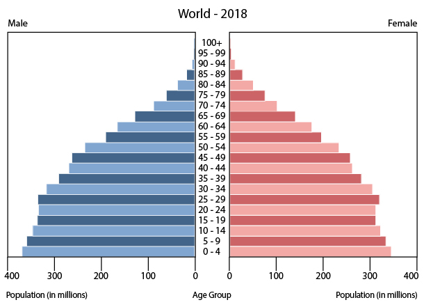
An age structure diagram is a vital tool for anyone studying population dynamics in AP® Environmental Science. They visually represent the distribution of different age groups within a population, often divided by gender. Moreover, these diagrams help illustrate how a population’s size and growth may shift over time. Understanding age structure is key to predicting a population’s future trends because younger and older individuals contribute differently to birth rates, death rates, and resource usage.
This guide explains what an age structure diagram is and how to interpret it step by step. It also explores real‑world examples, population policies, and why such knowledge is crucial for planning. Consequently, by the end, it should be clear that these diagrams form an essential foundation for understanding broader environmental science concepts regarding population growth and resource management.
What Is an Age Structure Diagram?
An age structure diagram represents the number or percentage of individuals in each age group for a given population. Typically, the diagram is shaped like two back‑to‑back bar graphs. One side shows male population data, and the other shows female population data. Each bar’s length corresponds to the proportion or absolute number of individuals in a specific age range.
Because these diagrams show how many people are in each age cohort, they are extremely useful in anticipating population changes. For instance, a very broad base of younger individuals often suggests that birth rates are high, which may lead to rapid population growth over time. Conversely, a narrower base indicates fewer births and possibly slower growth or even population decline. Therefore, age structure diagrams hint at future trends in resource needs, healthcare demands, and ecological pressures.
Components of Age Structure Diagrams
Age structure diagrams separate individuals into different age groups. These groupings are often labeled as:
- Pre‑reproductive (commonly 0–14 years)
- Reproductive (commonly 15–44 years)
- Post‑reproductive (commonly 45+ years)
However, the exact boundaries of these categories can vary by study. Meanwhile, the central axis of the diagram typically represents the population size or percentage. Males are shown on the left side, and females appear on the right.
Below is a simplified checklist of what to look for in a typical age structure diagram:
- Age intervals on the y‑axis (e.g., 0–4, 5–9, 10–14).
- Population counts or percentages on the x‑axis.
- Gender split down the middle (males on one side, females on the other).
These components together illustrate how different segments of the population are distributed. Observing their relative widths can provide clues about social structures and potential growth patterns.
Interpreting Age Structure Diagrams
Understanding Population Growth Rates
A quick glance at an age structure diagram can reveal whether a population is growing, stable, or declining. Therefore, environmental scientists frequently use these diagrams to answer critical questions about demographic trends. Population growth rates can be inferred from the shape of the diagram:
- A “pyramid” or triangular shape with a wide base suggests a rapidly growing population. A high proportion of young individuals indicates that many members have yet to reach reproductive age, potentially leading to a significant increase in births over time.
- A “column” or rectangular shape implies a stable population, where the percentages of younger and older individuals are somewhat balanced. This usually indicates that the birth rate is roughly equal to the death rate.
- An “inverted pyramid” shape with a narrow base and a wider top indicates a declining population. Fewer young individuals are present to replace aging cohorts, so the population may shrink.
In addition, some diagrams show slight bulges or dips, revealing historical events such as population booms, wars, or sudden changes in birth rates. These variations help scientists and policymakers plan for future scenarios, whether that involves allocating resources or reforming social programs.
Step‑by‑Step Example: Analyzing an Age Structure Diagram
Consider a hypothetical age structure diagram representing a fictional country called Greensville. Suppose the chart looks like a pyramid with a noticeably broad base and narrowing bars at older ages. Interpreting it can be done as follows:
- Identify age groups: Note the y‑axis listing increments of five years (0–4, 5–9, etc.).
- Determine the overall shape: Observe that the bars for younger age groups are significantly wider than those for older age groups.
- Infer potential growth trends: Conclude that a large proportion of the population is in the pre‑reproductive cohort. This indicates high potential birth rates in the coming decades, suggesting rapid population growth.
As a result, Greensville’s government would likely need to plan for more schools and greater housing demand. Meanwhile, in the long term, healthcare systems would also need to prepare for when this sizable younger generation enters later life stages.
The Relationship Between Age Structure and Population Dynamics
Population dynamics examines how populations change in size, density, and distribution over time. Age structure diagrams are integral to this field because they reveal more than just current demographics. In fact, an uneven distribution of youth or seniors can forecast economic and ecological challenges.
For example, a country with many older adults may face increased healthcare costs and labor shortages if there are not enough young people to fill critical roles. Conversely, nations with a predominant youth population could benefit from a vibrant workforce but might struggle with resource scarcity if job opportunities and chronic needs outpace economic capacity. Therefore, age structure directly influences policies for education, healthcare, and resource management.
Real‑world examples include:
- Japan, often shown with an inverted pyramid, faces issues related to an aging population, such as strained pension systems.
- Nigeria, frequently depicted with a broad‑base pyramid, grapples with high youth unemployment and the need for expanded educational infrastructure.
By recognizing these patterns, people can connect demographic data to policy decisions, natural resource management, and sustainable development strategies.
The Impact of Population Policies
Because age structure shapes a country’s future, many governments implement specific population policies to adjust demographic trends. For instance, in rapidly growing populations, governments may promote family planning or provide incentives to have fewer children. Policies might include accessible contraception, public education campaigns, and economic benefits for smaller families.
On the other hand, governments in nations with declining populations could offer incentives for larger families. They might provide tax breaks, childcare subsidies, or extended parental leave to encourage higher birth rates. Additionally, some countries adjust immigration policies to bring working‑age individuals into their labor force. Consequently, both national and local policies can greatly influence the shape of future age structure diagrams.
These decisions often carry environmental implications because population size affects natural resources. Rapidly growing populations, for example, can place stress on water supplies, farmland, and energy sources. Meanwhile, declining populations might see abandoned infrastructure or challenges in maintaining economic growth. Ultimately, population policies and environmental strategies are deeply intertwined.
Conclusion
Age structure diagrams are indispensable in AP® Environmental Science because they succinctly illustrate how a population’s age distribution can affect social systems, resources, and future growth trends. By examining the shape of these diagrams, it becomes possible to forecast whether a population is expanding, stabilizing, or shrinking. Consequently, understanding these patterns enables better planning for healthcare, education, and resource allocation.
Environmental concerns, such as overuse of resources and habitat degradation, are also closely connected to population dynamics. Therefore, analyzing age structure data is often the first step in responsible and sustainable policy making. Exploring real‑world examples or constructing hypothetical scenarios can refine these interpretation skills. Ultimately, mastering the ability to read and interpret age structure diagrams prepares students to address real‑life environmental challenges in a balanced and informed way.
Important Vocabulary
- Age Structure Diagram: A visual representation of the distribution of various age groups in a population, typically divided by gender.
- Pre‑reproductive: Age group that includes individuals who are too young to reproduce.
- Reproductive: Age group that includes individuals who are capable of reproduction.
- Post‑reproductive: Age group that includes individuals who are no longer capable of reproduction.
- Population Growth Rate: The rate at which the number of individuals in a population increases or decreases over time, often represented by r = \frac{\Delta N}{N_0 \times \Delta t}.
Sharpen Your Skills for AP® Environmental Science
Are you preparing for the AP® Environmental Science test? We’ve got you covered! Try our review articles designed to help you confidently tackle real-world AP® Environmental Science problems. You’ll find everything you need to succeed, from quick tips to detailed strategies. Start exploring now!
- AP® Environmental Science: 3.2 Review
- AP® Environmental Science: 3.3 Review
- AP® Environmental Science: 3.4 Review
- AP® Environmental Science: 3.5 Review
Need help preparing for your AP® Environmental Science exam?
Albert has hundreds of AP® Environmental Science practice questions, free response, and full-length practice tests to try out.


.jpg)